
They tell you this...
But I see this...
Wampum. (wampumchronicles.com)
I think it'd be funny if people starting adding wampum beads and tassels to the logo, triggering another demand for change.
They tell you this...
[The primary logo of the Washington Commanders is a powerful "W." This symbol carries forward an element of the Washington Football Team chapter in the franchise's history and acknowledges the team's deep Washington roots, while the W's angled cuts, bolded lines and serifs signify forward movement and progress. The slanted elements of the stripes bordering the "W" are inspired by military rank insignia, helping to infuse the familiar mark with elements of the team's new identity. In the word mark, "WASHINGTON" introduces the tall and proud letters of the team's name. The cuts of the "C" lead the eye across the mark and the two stripes that frame the name pay homage to the D.C. flag and give the mark a sense of power and authority.](https://1000logos.net/wp-content/uploads/2022/02/washington-commanders-logo.jpg)
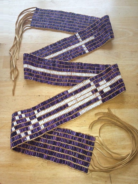
But I see this...
[Wampum.](http://www.wampumchronicles.com/remembrancebelt.jpg)
I think it'd be funny if people starting adding wampum beads and tassels to the logo, triggering another demand for change.
(post is archived)